Match-3 games ask players to scan a dense board, predict a move, and understand a chain of results in seconds. Art direction is therefore part of the rules: shape, color, motion, sound, and effect timing tell the player what can move and what just happened.
Candy Crush is a useful case because its board language is broadly recognizable. The goal is to study the hierarchy, then test original assets inside your own match-3 prototype rather than reproducing King's characters or branded candy designs.
Quick read
Key takeaways
- Give every core piece a distinct silhouette and internal mark, not only a different hue.
- Reserve the brightest motion and largest effects for meaningful board events.
- Keep board state visually dominant over backgrounds, progression UI, and monetization surfaces.
- Design special pieces so their appearance predicts the direction and scale of their effect.
Make the Pieces Read Before the Color
A player should be able to separate neighboring pieces at a glance. Use silhouette, internal marking, value, edge treatment, and controlled highlights together. Color can reinforce identity, but it should not carry the entire rule system.
Game Accessibility Guidelines recommends backing color with symbols, patterns, shapes, or text when information is essential. That principle is especially relevant to a board where several colors repeat dozens of times.
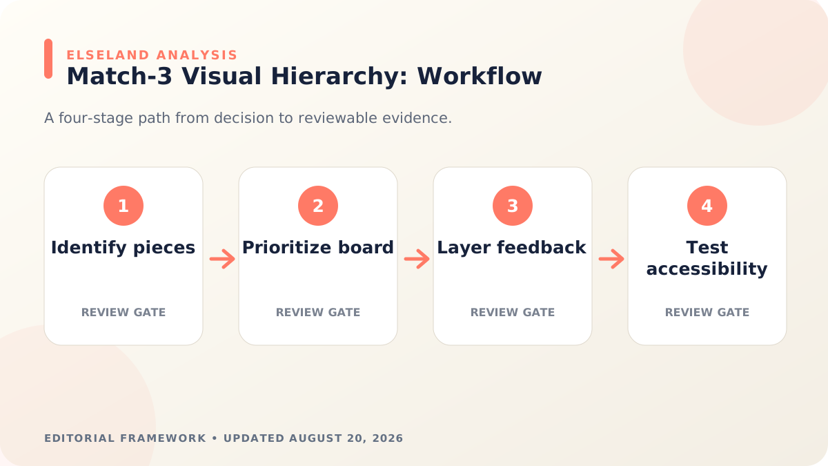
Build a Strict Visual Hierarchy
The board, goal, moves remaining, and active blockers are primary. Background characters, maps, offers, and decorative motion should sit below them. Reduce contrast and animation outside the decision area while the player is planning a move.
Special pieces may be more detailed than regular pieces, but their effect must remain predictable. Directional stripes, wrapped volume, or other original signifiers should communicate what will happen before activation.
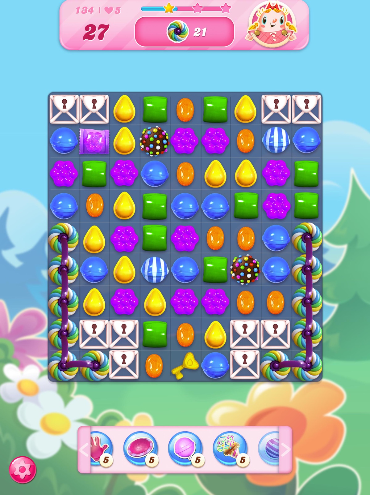
Layer Feedback by Importance
Use a small response for a normal match and larger combinations of scale, particles, camera motion, score treatment, and sound for rare events. If every swap triggers maximum spectacle, the system loses the ability to signal importance.
Sequence the response: input confirmation, piece movement, match resolution, special activation, board refill, then stable state. Overlapping everything can make a successful chain feel visually confusing rather than satisfying.
Design an Asset System That Can Scale
Build master templates for regular pieces, blockers, goals, special states, disabled states, and tutorial highlights. Record outline thickness, highlight placement, shadow direction, effect palette, and export dimensions.
If AI is used to explore variants, lock those rules in a style specification and review the art consistency workflow before expanding the asset family.
Test With Real Boards, Not Isolated Icons
Place the full piece set on common, worst-case, and color-vision-simulated boards. Test at the smallest supported display size and during chain reactions. Ask players to identify legal moves and explain special effects without coaching.
Browse puzzle games to compare how board density and feedback change across different rule sets, then document the choices that belong to your own game.
Worked Example: Design Six Original Match-3 Pieces
Create six pieces that differ in silhouette, internal symbol, value grouping, and color. Begin in grayscale to test separation, then add color as reinforcement. Place the set on three boards: a neutral board, a visually busy blocker board, and a board under a large chain reaction.
Add one striped or directional special piece, one area-effect piece, and one obstacle. Before effects are animated, ask players to predict what each one will do. If they cannot, the art is decorating a hidden rule rather than communicating it.
| Layer | Player question | Art response |
|---|---|---|
| Regular piece | What can I match? | Distinct silhouette, symbol, and color |
| Special piece | What will this trigger? | Directional or area cue before activation |
| Blocker | Can it move or break? | Material and damage-state language |
| Goal | What matters this level? | Stable icon repeated in HUD and board |
| Feedback | What just changed? | Timed motion, effect, sound, and score hierarchy |
Allocate a Visual Attention Budget
Treat player attention like a limited rendering budget. The board state and current goal receive the strongest contrast. Available moves and important special pieces receive secondary emphasis. Background characters, maps, and decoration should quiet down while a decision is being made.
Write an attention map for planning, swap, resolution, cascade, failure, and completion states. The same element may change priority across the sequence: a goal icon is prominent during planning, while the matched region and chain path dominate during resolution.
- Planning: stable board, goal, and moves remaining
- Input: selected pieces and legal swap feedback
- Resolution: matched region and special-effect direction
- Refill: movement path without hiding the new stable state
- Outcome: success or failure without obscuring the final board evidence
Diagnose a Board That Feels Visually Noisy
Noise can come from too many high-contrast edges, simultaneous idle motion, effects that outlive the state they explain, or backgrounds sharing the same value and saturation as pieces. Freeze the board at each phase and identify which elements compete with the next decision.
Accessibility guidance recommends that essential information not depend on fixed color alone. Shape and symbol reinforcement also improves speed for every player when particles, screen glare, small displays, or rapid chains reduce color discrimination.
| Symptom | Likely cause | Next check |
|---|---|---|
| Pieces merge together | Similar silhouette and value | Redesign outline and internal mark |
| Special effect surprises player | Appearance does not predict area | Add directional or radius cue |
| Board feels exhausting | Everything moves or glows | Reserve motion for state changes |
| Goal is forgotten | HUD and board icons differ | Use one repeated goal symbol |
| Colorblind confusion | Hue is the only identifier | Add shape, pattern, symbol, or setting |
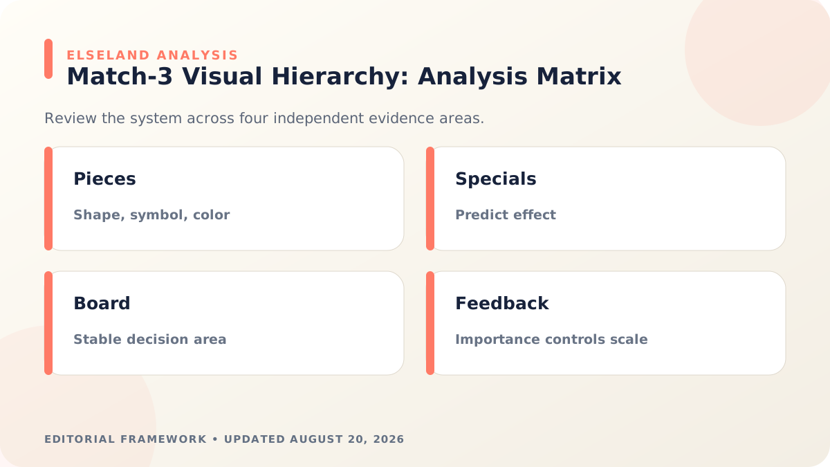
Match-3 Art Review Checklist
Review the complete board at the smallest supported size and at normal play speed. Zoomed-in asset sheets hide the interactions between piece density, blocker damage, goal icons, hints, effects, and UI.
Use original shape and material language. Studying Candy Crush means learning from hierarchy and feedback—not reproducing its candy silhouettes, characters, map, sounds, or branded effects.
- Regular pieces remain identifiable in grayscale and color-vision simulations.
- Special pieces predict effect direction or area before activation.
- Blockers show movable, breakable, layered, and cleared states consistently.
- Effect scale and duration correspond to event importance.
- Background contrast and motion reduce while the player plans.
- Tutorial highlights, goals, board pieces, and HUD use the same visual vocabulary.
What the Primary Sources Establish About Match-3 Game Art Design
Our evidence baseline starts with the GDC: Candy Crush Postmortem, accessed August 20, 2026. We use it to establish documented behavior, terminology, or constraints—not to claim that the source endorses Elseland's workflow or conclusions. The practical artifact under review is a complete board mockup tested at gameplay scale with color, shape, motion, and effect states.
That distinction is central to E-E-A-T. A first-party page can establish what a format, tool, platform, model, or game team publicly documents. It cannot prove that a particular asset is fast, accessible, legally cleared, fun, or production-ready. Those conclusions require separate observation, measurement, specialist review, or player evidence tied to the actual project.
For this topic, the decision is whether players can parse pieces, goals, blockers, specials, and outcomes under time pressure. The following observations turn the official reference into a reviewable production record rather than a decorative citation:
| Evidence layer | What it can support | What it cannot support alone |
|---|---|---|
| Official source | Documented feature, rule, format, or published design context | Project-specific quality or universal performance |
| Project measurement | Observed behavior in a named build, scene, device, or sample | Unmeasured platforms or future versions |
| Human review | Usability, visual, editorial, and production judgment | Legal certainty or population-level player behavior |
| Release record | Who approved what, when, with which evidence | Permanent compliance after inputs or rules change |
- 1. evaluate the board as an information hierarchy rather than a collection of attractive assets. Store the result with the asset or build identifier so another reviewer can reproduce the conclusion.
- 2. give essential piece classes redundant shape or symbol cues. Store the result with the asset or build identifier so another reviewer can reproduce the conclusion.
- 3. reserve the largest motion and brightness changes for the most important events. Store the result with the asset or build identifier so another reviewer can reproduce the conclusion.
- 4. test grayscale, color-vision simulations, and peripheral readability. Store the result with the asset or build identifier so another reviewer can reproduce the conclusion.
A Field Review Protocol for Match-3 Game Art Design
Use this protocol after the first plausible output exists and before scaling the workflow. Keep one untouched baseline, one candidate revision, and one deliberately stressed case. The stressed case should expose the topic's likely failure mode—crowded scenes, extreme poses, small-screen play, unusual inputs, or a release-rule change—rather than merely repeat the easiest success case.
Run the review in the real delivery context whenever possible. Capture the tool or model version, source files, settings, target device or engine, date, and reviewer. If the work depends on a changing external service, record the response or exported artifact instead of assuming the same output can be recreated later.
A useful review ends with a decision and a next action. “Looks good” is not a gate. State whether the candidate passes, passes with a bounded exception, needs revision, or should be rejected; identify the evidence behind that status and the owner of the next check.
| Review status | Meaning | Required next action |
|---|---|---|
| Pass | All defined visual, technical, and release gates are supported by evidence | Freeze the reviewed artifact and link it to the build |
| Conditional pass | A known limitation is bounded and does not invalidate the intended use | Document the exception, owner, and trigger for re-review |
| Revise | The direction is viable but one or more gates remain unsupported | Change one controlled variable and repeat the affected checks |
| Reject | The candidate conflicts with the intended use, evidence, rights, safety, or budget | Preserve the record and choose a different approach |
- list every object a player must distinguish during a move. Record the expected result before the check, then attach the observed result and any exception after it.
- assign unique silhouettes, internal symbols, and controlled palette roles. Record the expected result before the check, then attach the observed result and any exception after it.
- separate stable board information from transient feedback. Record the expected result before the check, then attach the observed result and any exception after it.
- compare ordinary matches, specials, blockers, failure, and success. Record the expected result before the check, then attach the observed result and any exception after it.
- test on a small mobile viewport and in motion. Record the expected result before the check, then attach the observed result and any exception after it.
- record confusion points from unprompted player observation. Record the expected result before the check, then attach the observed result and any exception after it.
Expert Interpretation and Limits of This Game Art & Visuals Guide
The strongest conclusion this guide can support is a conditional production recommendation: use the workflow when its documented assumptions match the project, and keep the evidence needed to revisit the decision. We do not infer universal model quality, player preference, legal clearance, or performance from an official screenshot, a provider example, or a single successful asset.
Experience matters here because match-3 game art design crosses creative judgment and implementation detail. The practical review should include the people who will edit the source, integrate the result, test it in play, maintain it after release, and answer rights or policy questions. A narrow expert handoff often misses problems that appear only when those responsibilities meet.
Before publishing or shipping, repeat time-sensitive checks against the current source and exact build. Preserve dated evidence, disclose the evaluation method, and distinguish measured results from editorial inference. That record is more valuable than a confident conclusion that future reviewers cannot reproduce.
| Claim type | Editorial treatment |
|---|---|
| Documented fact | Link to GDC: Candy Crush Postmortem and include the access date |
| Observed project result | Name the build, environment, sample, and method |
| Expert judgment | State the criteria, reviewer role, and tradeoff |
| Inference or forecast | Label it explicitly and describe what evidence could change it |
- Visual similarity to Candy Crush does not establish comparable usability.
- Contrast ratios alone cannot predict crowded-board readability.
- Color-accessibility checks must include effects, overlays, and disabled states.
- Player comprehension should be observed; designer familiarity is not evidence.
Frequently asked questions
Why is Candy Crush useful as a match-3 art case study?
Its public gameplay shows a mature visual hierarchy in which pieces, blockers, goals, and effects must stay readable across many boards. The useful lesson is the system, not the branded asset style.
Should match-3 pieces be distinguished by color alone?
No. Reinforce color with silhouette, internal symbols, patterns, value, or edge treatment so essential state remains understandable to more players.
How much animation should a puzzle board use?
Use motion to confirm input, explain state changes, and reward important events. Decorative animation should not compete with the player's next decision.
Can AI generate a full match-3 asset set?
It can accelerate concepts and variations, but a human should enforce piece identity, hierarchy, accessibility, effect logic, and consistent export rules across the complete board.
How many visual identifiers should a match-3 piece have?
Use at least two independent identifiers for essential piece identity, such as color plus silhouette or symbol. Additional texture and highlight differences can help, but they should not make the board harder to scan.
How should match-3 art handle hint animations?
Hints should be visible without becoming constant background noise. Delay them long enough to preserve player agency, animate only the relevant pieces, and stop the motion as soon as the player acts or the board changes.
What makes a blocker visually understandable?
Its material, outline, damage states, movement rules, and relationship to the tile should imply how it behaves. Reuse the same crack, layer, lock, or containment language across blockers with similar rules.
How can a team test puzzle-art readability?
Ask fresh players to identify piece types, goals, blockers, and special effects from static and animated boards without explanation. Record errors by board state and display size, then revise the visual system rather than teaching around repeated confusion.
Sources and further reading
- GDC: Candy Crush Postmortem
A King presentation on the design and development of Candy Crush Saga.
- Game Accessibility Guidelines: color
Guidance on supplementing color with other readable signals.
- W3C non-text contrast guidance
Authoritative accessibility guidance for visual information and interactive states.
Next step